
Passion project
Tilburg Trappers
goes heavy
Strike of the stag

After last season ended I felt a little lost, missing the thrill of watching the Trappers on the ice. To keep that feeling alive, I decided to start a small side project. I’ve always loved Tilburg Trappers because they are talented, focused and have a presence that makes you want to cheer louder every game.
For this project I reimagined their logo, keeping the raw intensity of the deer at the center of their identity, while adding a hint of Scandinavian darkness. I also wanted to create t-shirts and hoodies inspired by heavy metal aesthetics. Throughout it all I was blasting Turnstile, letting their hardcore energy push the designs forward. Take a little peak into the world where heavy metal meets Tilburg Trappers with some of my design.

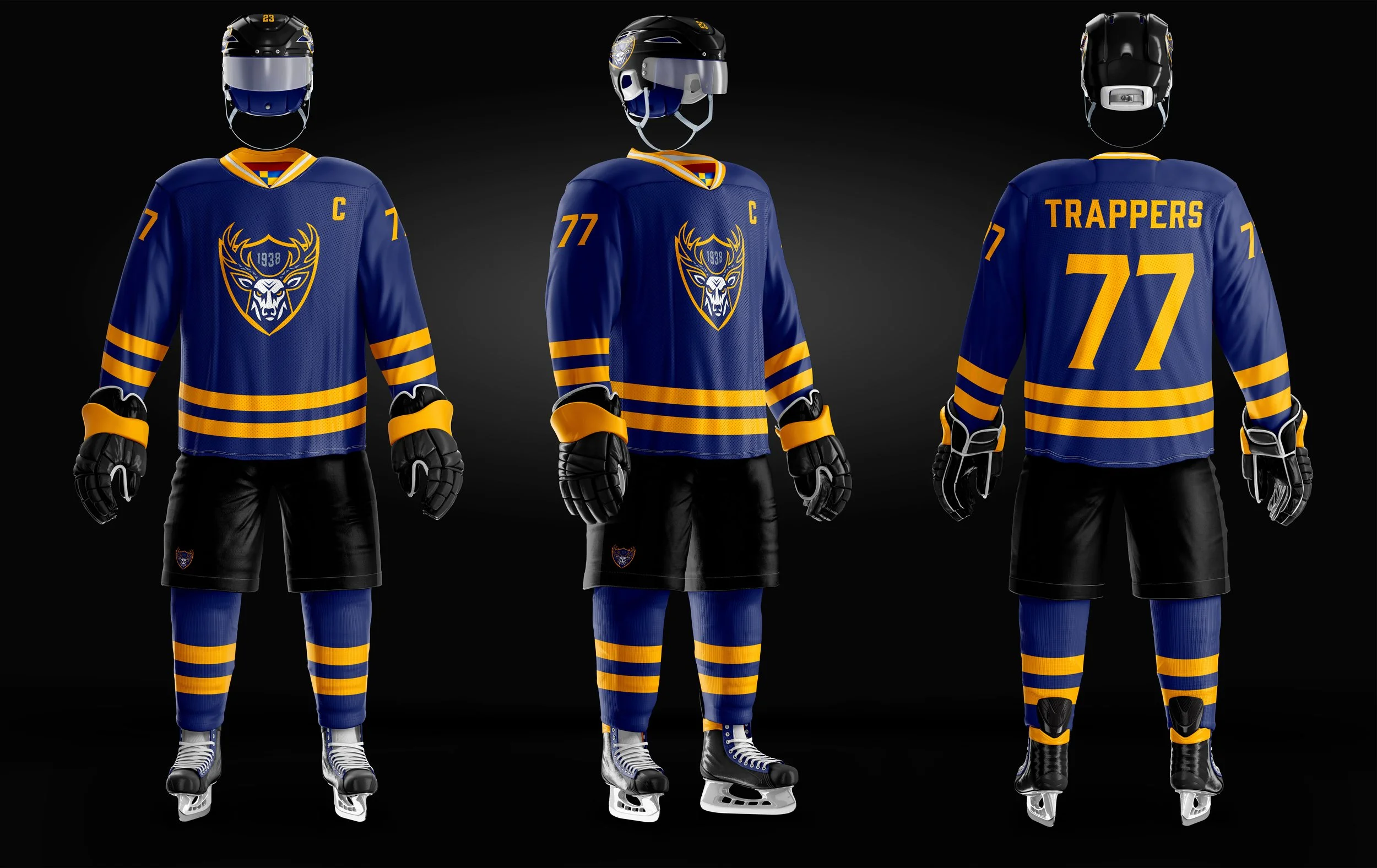

Jerseys
For this project I designed three versions of the Trappers jersey. The first is a limited edition black jersey with the Trappers name written in a bold heavy metal style, giving it an intense, edgy vibe. The other two are the home and away jerseys, keeping things clean and simple. The home jersey is blue, while the away jersey is yellow, both reflecting the team’s classic colors in a modern, minimalist way.
Can you spot the Tilburg flag?
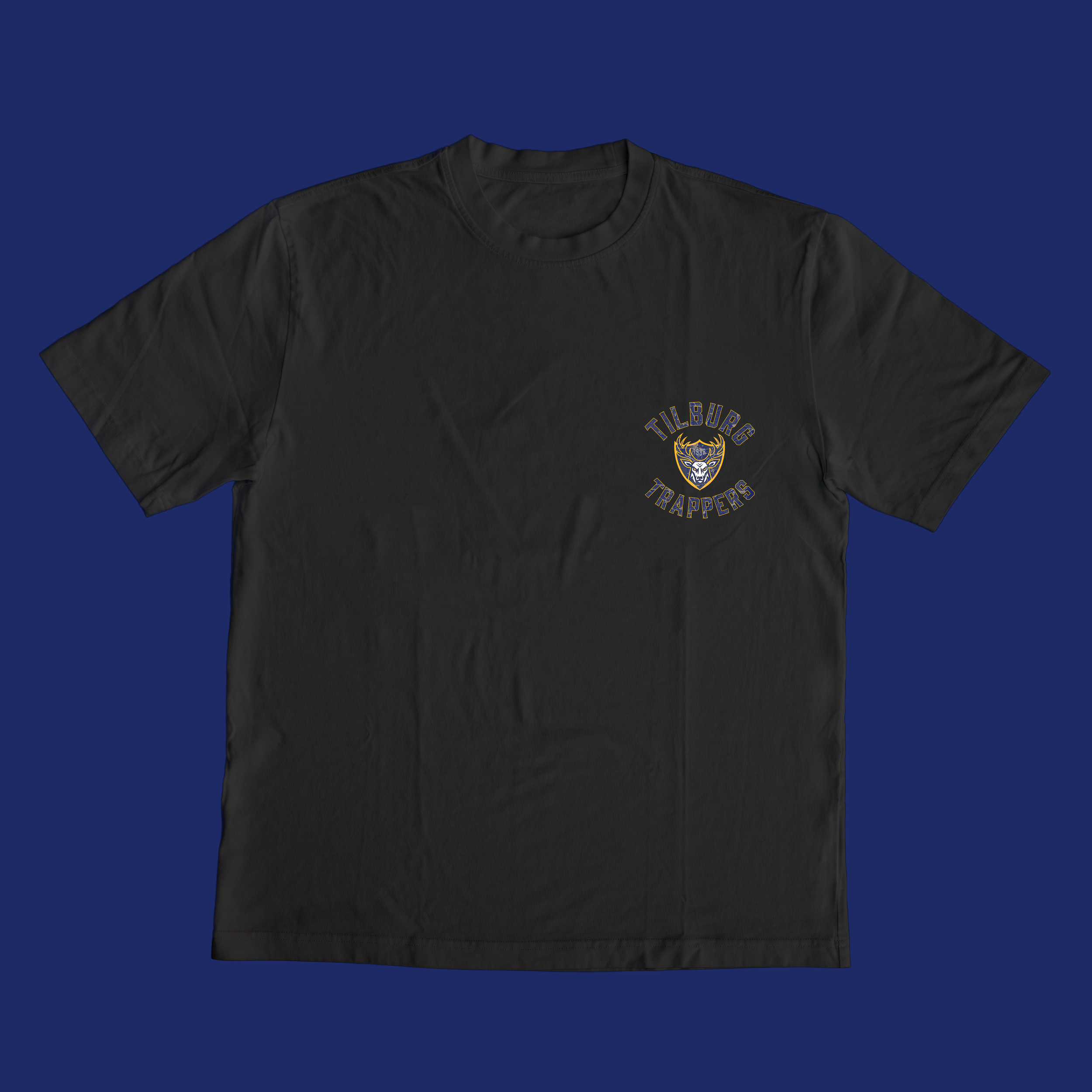


Merchandise
Next up is the merchandise designs, bringing the energy of the Trappers off the ice. Everything is black and inspired by heavy metal aesthetics. One features a short verse, like something you would see on a band tee, giving it a raw, intense feel. The other carries the tagline Strike of the Stag, capturing the team’s power and spirit in a bold, simple way. I designed a hoodie that brings the city of Tilburg into the mix. I incorporated the Tilburg flag into the design and used a bold heavy metal font on the front, giving it a strong, edgy look while celebrating the team’s hometown.